I've been swamped with working on another series show, that I just finished this morning, that I'd not been able to pick out the panels I wanted to show here.
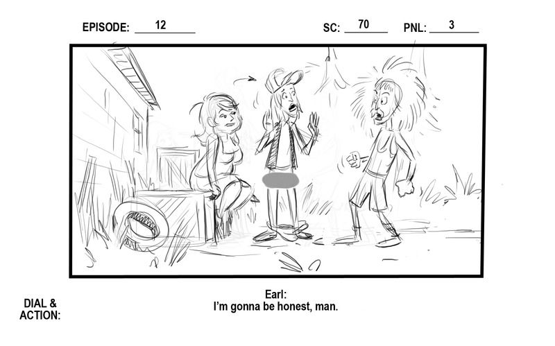
This is a small section from a 4 minutes web-isode for " Don't Feed the Humans" Episode 12 " Origin" Earl".
This job was a bit trickier than the norm, because other than the basic stock designs, I only had notes from the show-creator and the director to work off of. I had a script, and was working on it about 2 weeks before the storyboard was supposed to be assigned to anyone. The upshot is that although I was flying blind a bit, they trusted my judgement on it.
The challenge here was that there was a sex scene and it had to be obvious, but not gratuitous or show too much.
It also had to be funny.
And in telling something cinematically risque.....the question is always......"where do you put the camera??".
How do you show as much as you can show.....and not show......much. And the thing is that you can place the camera just about anywhere, but it works better from certain angles more that it does from others. For example: imagine starting what you see here with the camera directly overhead, looking down. It would be lurid, and certain obvious as to what is going on......but would it be funny? Or entertaining? Likewise, starting this "sequence" with the camera behind Earl....would that work? Or do we need to see Shirlene right away to get the whole set-up and not "lose the thread", so to speak?? Get the idea?
The following panels are my take on this, and following them is a link to the actual episode on Youtube so you can see how the storyboard translated into film.
See what you think.
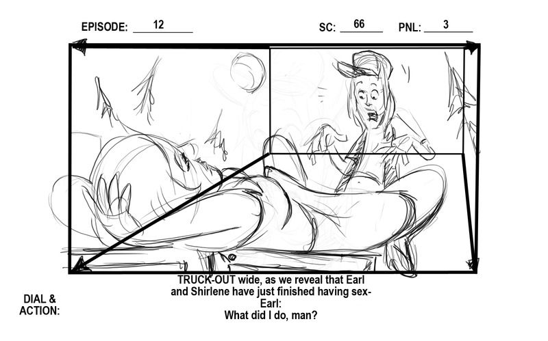
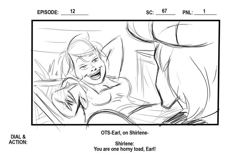
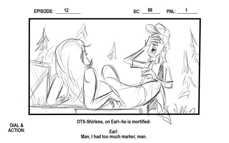
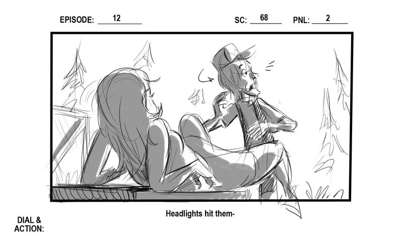
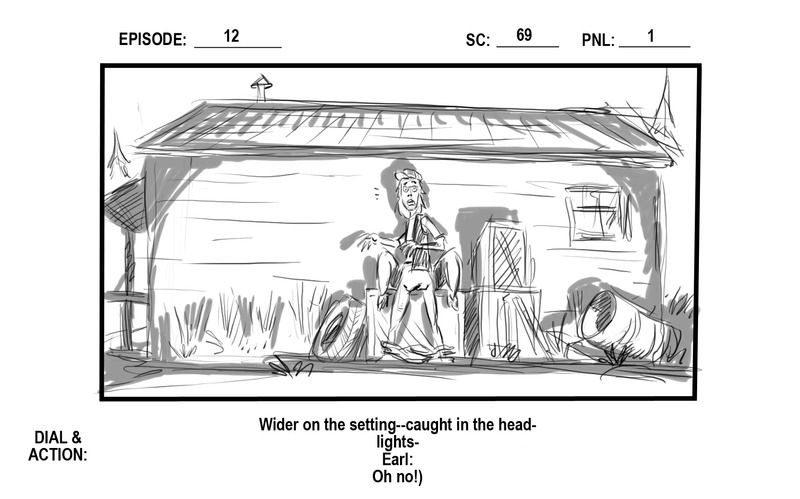
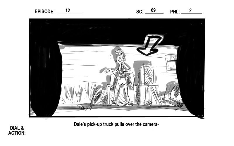
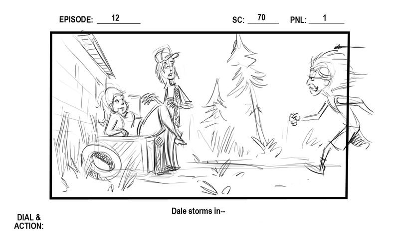
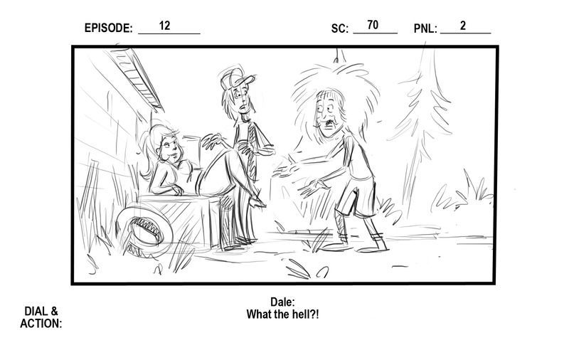
And the episode itself can be seen at:
https://www.youtube.com/watch?v=BdNQEhRLXEE


 So you establish the angles and framing of the scenes, too? That's too cool.